B2B SaaS Construction : Edition 01Same Prompt, Two Products
Written: June 18, 2026
Project Context:
This project is part of an AI-native workflow portfolio series. The product is a B2B SaaS dashboard for construction site inspection and issue tracking. The core user is a Site or Project Manager at a mid-size general contractor running multiple active job sites, currently managing inspections through phone photos, paper checklists, and group chats with no structured view of open issues, severity, or resolution status.
The main flow is AI Site Inspection and Issue Tracking, chosen because it mirrors the Skin Analytics diagnostic pattern I built at GESKE (photo input to AI analysis to structured output), which drove a 2.8x MAU increase. Same underlying logic, different domain, different stakes.
Summary:
I ran the same detailed prompt through Lovable and v0 to see whether the tool matters when the spec is tight. Lovable looked more polished at first glance. v0 looked rough. The more I used both, the more that first impression broke down. And then v0 kept changing, without a new prompt, without credits spent. I chose v0 as the foundation going forward. A tool that produces a prettier skin over a worse structure is a more dangerous choice than one that looks rough but thinks clearly.
Deep Dive
The prompt as a design artifact
The brief wasn't a rough description but a full spec. Four screens, exact hex values, severity logic, mock data with Berlin addresses. Writing it forced me to make design decisions before touching either tool. Any difference in output came entirely from how each tool interpreted the same text.
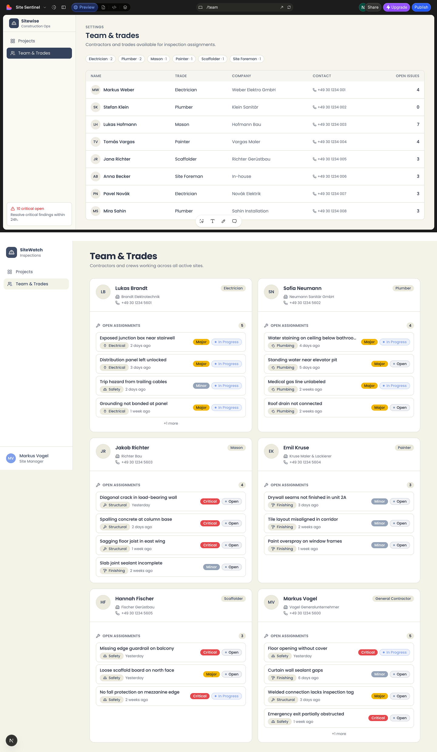
Lovable (top) vs. v0 (bottom) Team & Trades Page: Same prompt, same screen, two different interpretations.
Lovable: better surface, worse structure
The color palette landed close to spec. But the data visualization was wrong. Lovable parsed the component names without grasping the decision logic behind them. Charts appeared in formats that looked appropriate but communicated the wrong things. The dashboard looked like a product without behaving like one.
One failure was specific enough to document. The Projects Overview used three horizontal progress bars for Critical, Major, and Minor issue counts. The deeper problem wasn't a missing maximum value, it was the pattern itself. Progress bars represent movement toward a bounded goal. Issue counts have no natural ceiling, so the bar had nothing real to measure against. The result showed up on the cards. One card with 2 critical issues had its bar half full. Another card, also with 2 critical issues, had its bar two thirds full. A third card with 3 critical issues had its bar completely full. The same number produced three different fill levels. You couldn't read the bar at a glance, you had to check the actual count anyway, which defeats the point of a visual.
A second issue showed up after a closer look. The exact same line, "10 critical open, resolve critical findings within 24h," appeared twice. Once at the bottom of the left navigation, and again as a card on the Projects Overview screen. Same message, word for word, in two unrelated parts of the same view. Redundant information that adds noise instead of clarity.
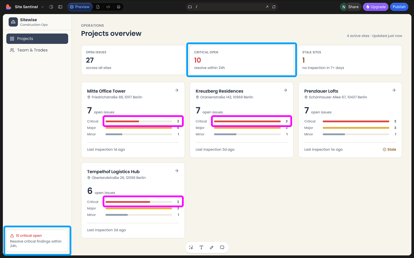
Lovable's Projects Overview, two data issues: The same critical count filling progress bars to different levels, and the same "10 critical open" message repeated in the navigation and on a project card.
v0: worse surface, better structure
The typography read as cheap. At a glance, Lovable won. But v0's card layout was more scannable, the severity hierarchy matched how a site manager would actually read a screen, and the component structure made sense. The visual layer can be rebuilt. That's Edition 02.
What I didn't expect was what happened next. Over the following day, without any new prompts and without touching the credit balance, the design changed. Dark mode became light. Typography tightened. A clipped CTA fixed itself. The prompt history stayed frozen two days back. Whether this is a background refinement queue, deferred processing, or something else, I don't know. But a tool that continues working on the problem after the conversation ends is worth paying attention to.
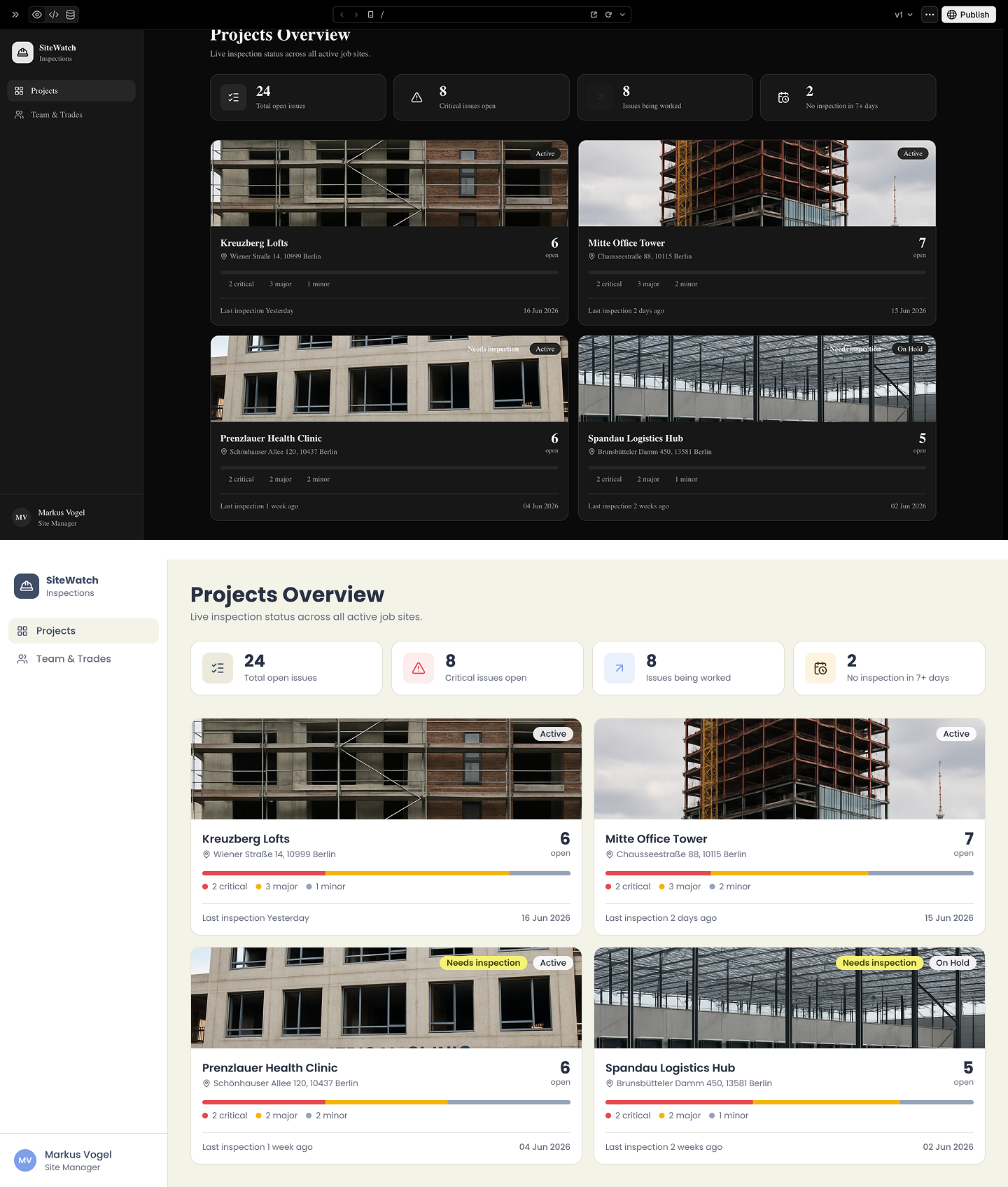
v0's Projects Overview, first generation vs. latest: The same screen at two points in time. No new prompts in between, the design kept changing on its own.
Critical Reflection
I assumed visual fidelity to the spec meant a tool had understood the brief. Lovable matched the hex values. I spent more time iterating inside it partly because it looked more worth saving. What I didn't test first was whether the output was structurally correct, which is the only thing that matters when the deliverable is a product.
If I ran this again, I'd evaluate data logic before visual details. Typography is fixable in an hour. Wrong information hierarchy hides under a polished surface and takes much longer to undo.
Conclusion
This edition covered a full-spec prompt doubling as a design document, a direct comparison between Lovable and v0, a data visualization audit, and a progress bar to alert badge redesign with WCAG-compliant severity logic.
v0 won on structure. Lovable didn't survive the data logic test. And v0 kept refining the visual layer on its own, without new prompts, which is worth paying attention to.
The v0 code is now local and version-controlled. Edition 02 works through the UI layer. Typography, spacing, and design system coherence.