AI-Native Design Workflow : Edition 06Design System Documentation & AI Visibility Page
Written: May 21, 2026
Summary:
I wrote DESIGN_SYSTEM.md, used it to generate a new page with Lovable, and shipped something real. I built the AI Visibility page from scratch by combining a detailed design system document with Lovable's code generation and my own correction pass. The page works. And the process taught me exactly where AI-assisted generation breaks down, and why that is not a problem to eliminate but a gap to manage.
The Goal: Expand the dashboard to a second page using Lovable, with DESIGN_SYSTEM.md as the consistency layer.
The Challenge: I was using an AI tool (Lovable) connected to my codebase via GitHub, expecting it to produce output that matched my existing design system. It did not: and understanding why that happened turned out to be more valuable than the page itself.
Deep Dive
1: Writing DESIGN_SYSTEM.md
Before touching Lovable, I wrote a comprehensive design system reference document: all color tokens, typography composite utilities, the full atom and molecule inventory, layout conventions, and 10 rules for prompting Lovable. I wanted to test whether a well-prepared document could replace the manual correction pass. The answer was no: but not for the reason I expected.

Lovable's first output, before any corrections. Colors bear no resemblance to the design system. Data visualization components are mismatched to their context. This is what AI-generated code looks like when the runtime environment doesn't match the codebase it read.
2: Discovering the real limitation of Lovable
Lovable was connected to my GitHub repository. It could read my entire codebase. Despite this, its output used TanStack routing instead of Next.js, shadcn token defaults instead of my custom tokens, and wrong layout constraints throughout.
The reason: Lovable's internal runtime is TanStack Start. Reading my Next.js codebase on GitHub does not change what framework Lovable executes against. The two environments are fundamentally separate. Lovable's design system consistency works when the design system is defined inside a Lovable project from the start: not when you bring an existing codebase to it.
This was not a preparation failure. The problem was the workflow, not the document. There are two ways Lovable works correctly: start inside Lovable from scratch, or treat it purely as a layout sketch and rewrite from its structure. I was between those two modes.
3: The correction pass
I rewired everything to Next.js App Router, replaced every shadcn token with the correct project token, switched raw font sizes to composite typography utilities, and connected the sidebar. This is the work Lovable cannot do. It is also the work that requires you to understand your own system deeply enough to know what is wrong and why.
4: Replacing duplicate data with a unique view
Lovable generated a citations table identical to ones already on two other pages. I replaced it with a Coverage Matrix: rows are pages, columns are platforms, each cell shows either the mention count or a dash.
The matrix answers a question the table cannot: which pages are being cited by multiple AI platforms simultaneously? I also redesigned the underlying data so that high-optimization pages appear across multiple platforms and low-optimization pages show mostly dashes. The correlation between content quality and platform coverage became readable at a glance.
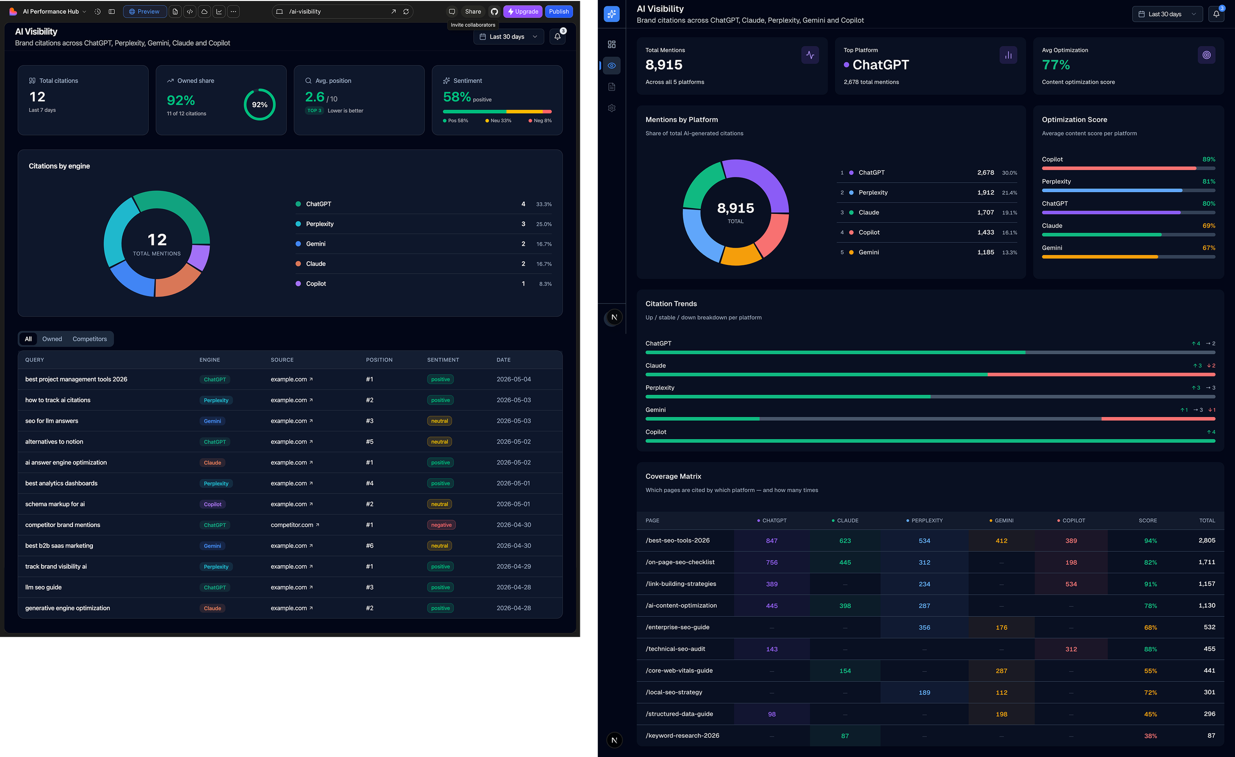
Before: Lovable's final output (left). No sidebar, and a citations table identical to the one already on two other pages. Same data, third view, no added insight.
After: Coverage Matrix (right). Sidebar connected, duplicate table replaced with a view that answers a different question: which pages are being cited by multiple AI platforms at the same time. High-optimization pages fill multiple columns. Low-optimization pages show mostly dashes. The pattern is the insight.
5: UI consistency pass
After the page was working, I ran a consistency pass across both pages and fixed: sidebar active state (useState replaced with usePathname), stat card layout (rebuilt to match Dashboard pattern), pie chart tooltip (replaced hardcoded hex with token-based CustomPieTooltip), section title typography (color, size, and padding unified across all three card sections), mobile overflow (subtitle hidden on narrow viewports), and platform naming (Google AI corrected to Gemini).
Critical Reflection
Shipping a second page with a workflow that scales.
By the end of this edition, I had a working second page with five distinct data sections, a unique analytical view, and consistent design language across the product. I got there by using AI to generate the structure, then applying enough system knowledge to fix what was wrong.
The most important thing I learned: AI generation and design system consistency are separate problems. Lovable generates fast. Keeping it consistent with an existing codebase requires a human who understands the system deeply enough to run the correction pass. That combination: AI speed plus human system ownership: is what makes this workflow actually work.
Conclusion / Next Step
Achieved: AI Visibility page designed and shipped, Coverage Matrix as a unique analytical view, realistic multi-platform citation data, full UI consistency pass across Dashboard and AI Visibility, mobile overflow fixed, platform naming corrected.
Edition 07: Next page. Content Ops or Settings: or deeper interactivity on existing pages.