GESKE German Beauty TechData-Driven
Skin Analytics
New Feature, 2024


The Problem
GESKE devices work. But users could not see that they were working.
In the beauty tech industry, efficacy is invisible. Skin improvements happen gradually, across weeks, not days. Without visible evidence of progress, users lost confidence in the product, stopped scanning, and eventually churned.
The existing app showed individual photos in isolation. There was no way to compare them, no data layer, and no system for tracking change over time. Users had to trust the product blindly.
The design challenge: make gradual progress visible, measurable, and motivating, without overwhelming users with complexity.
Objectives
Turn isolated skin scan images into a continuous, comparable timeline
Build a data architecture that connects visual evidence to numerical metrics
Design an entry point that users would actually find and use
Build a system capable of handling rapid user growth without performance degradation
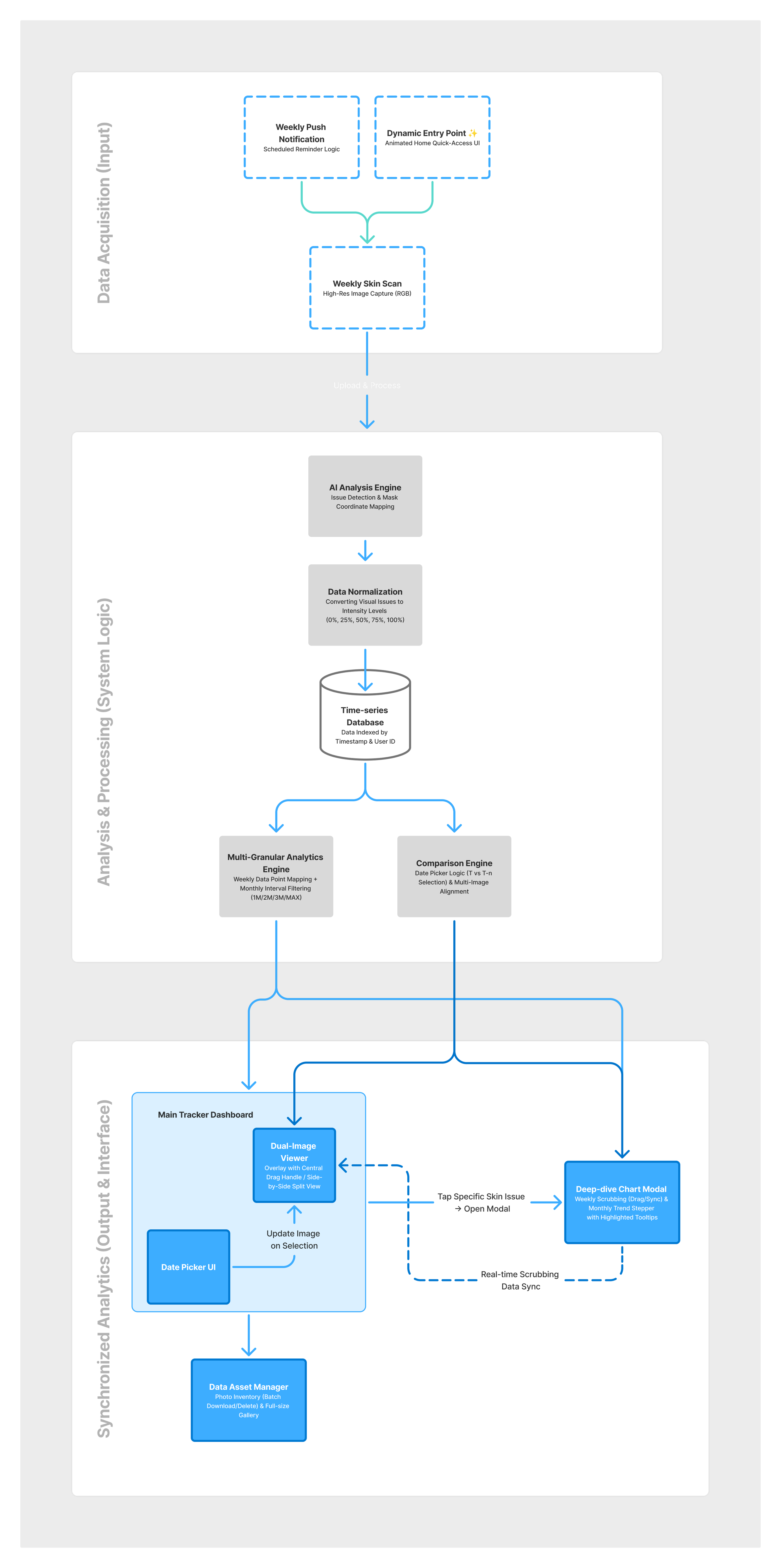
System Logic (End-to-End Data Architecture)
Before any interface work, I mapped the full data flow: from how scans entered the system to how they reached the user.
01. Proactive Data Acquisition
Goal: Ensure enough data points exist for meaningful trend analysis.
Decision: Integrated Scheduled Reminders into the flow. Without consistent scanning intervals, trend lines would be misleading. Reminders are not a UX nice-to-have. They are a data quality mechanism.
02. Time-series Data & Normalization
Goal: Enable fair comparison across different users and different skin tones.
Decision: Structured scan data into a time-series database and normalized all scores onto a 0–100% scale. Without normalization, a score of "40" means different things for different baseline skin conditions. A shared scale makes progress legible regardless of starting point.
03. Multi-way Synchronized Interface
Goal: Connect the visual (photo comparison) and the numerical (metrics) so neither exists in isolation.
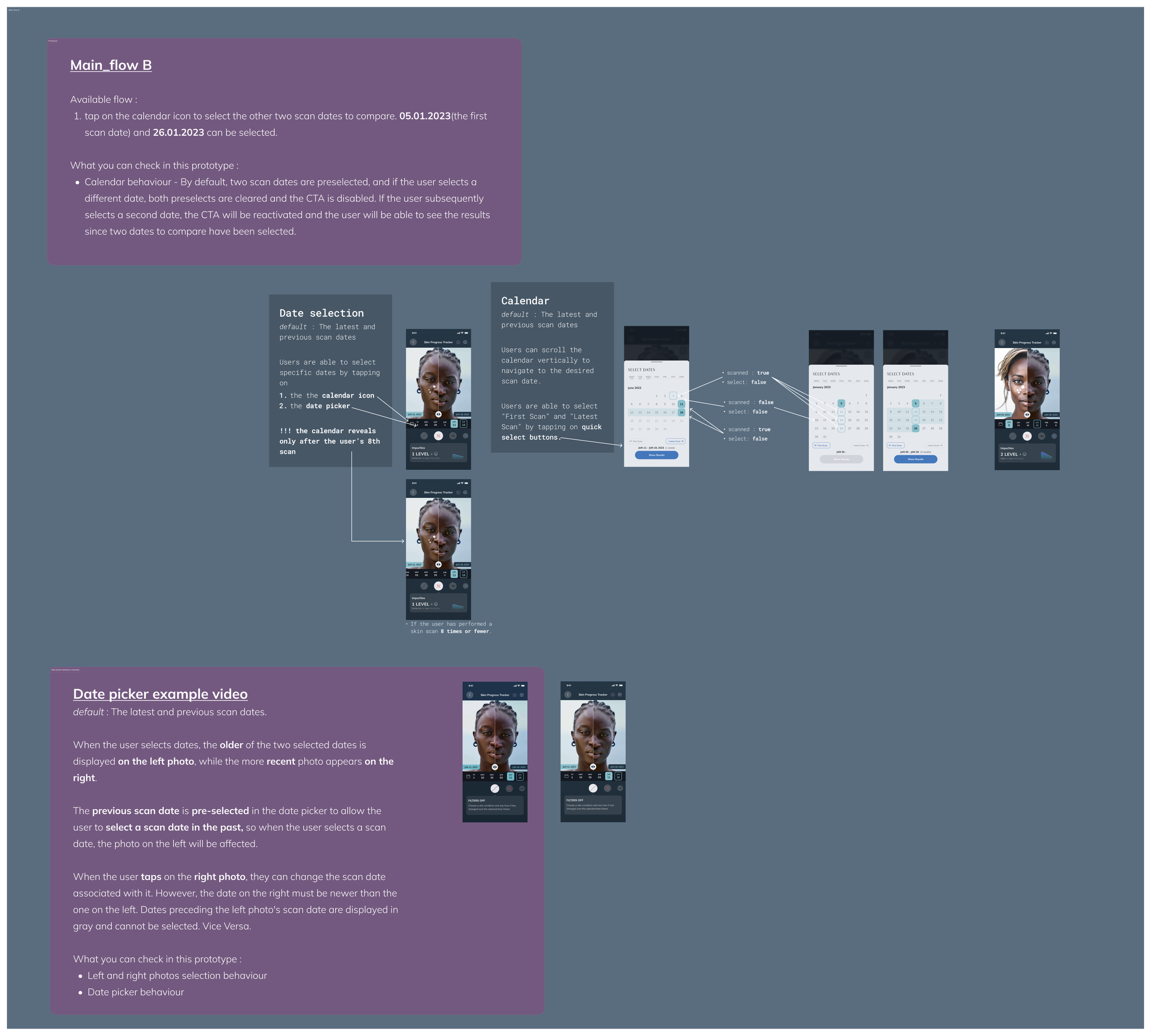
Decision: Tapping a metric populates the chart with the corresponding image in real time. The Data Picker, Metrics panel, and Chart view update together. The user is always looking at the same moment in time, from two different angles.
04. Data Asset Management
Goal: Handle bulk operations across a growing library of high-resolution skin scan images.
Decision: Designed an Asset Manager layer for multi-upload and data-privacy compliance. This was necessary to maintain system performance as the user base scaled.
Key Features
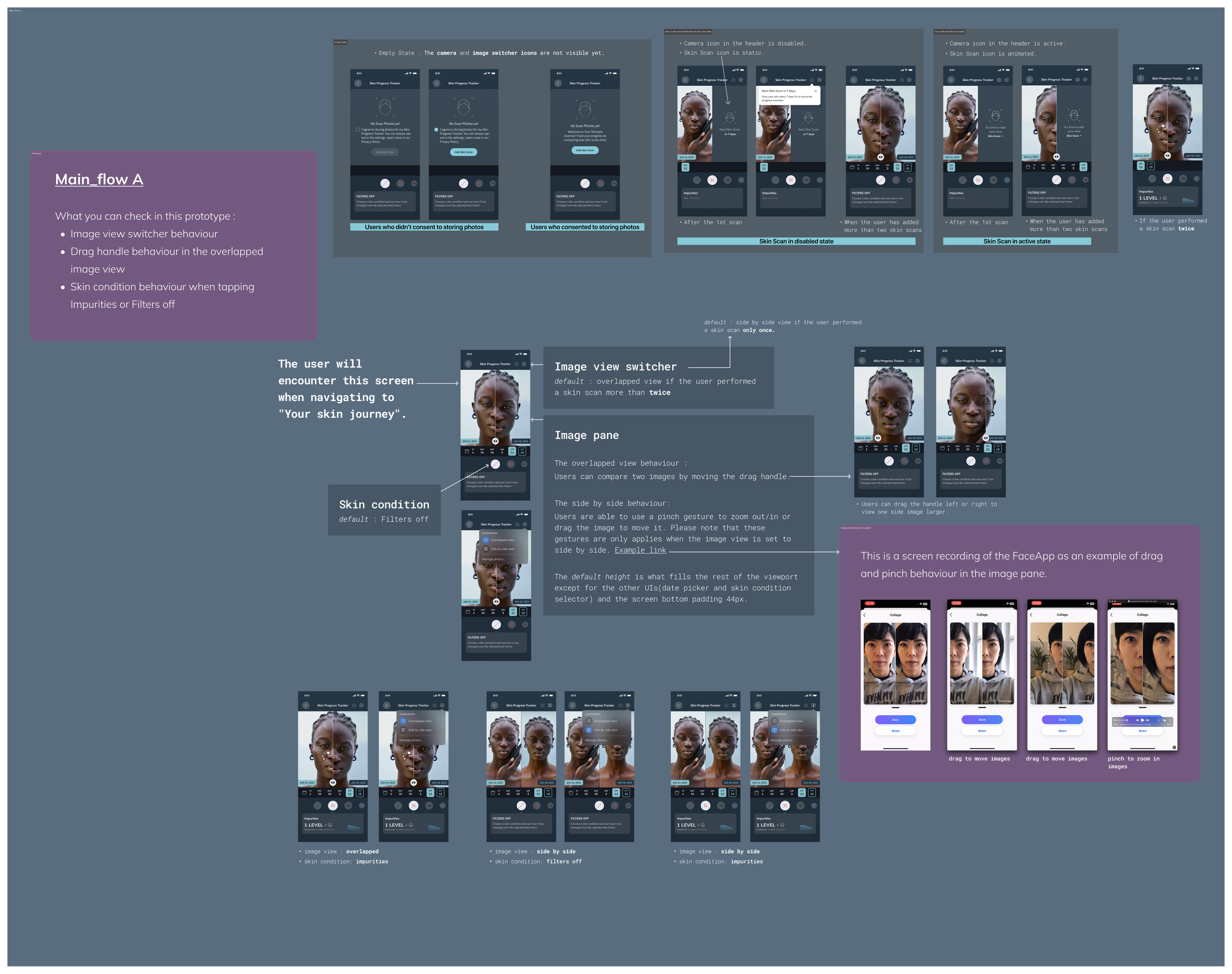
High-Fidelity Interaction Flow
The full scan-to-insight journey, from capturing a new image to reading trend data, designed as a single coherent flow without dead ends or context switches.
Core Comparison Engine (Split/Overlay & Metrics)
Two comparison modes: Split shows before and after side by side. Overlay layers images at adjustable opacity. Both modes feed directly into the metrics panel, so visual and numerical evidence stay connected.
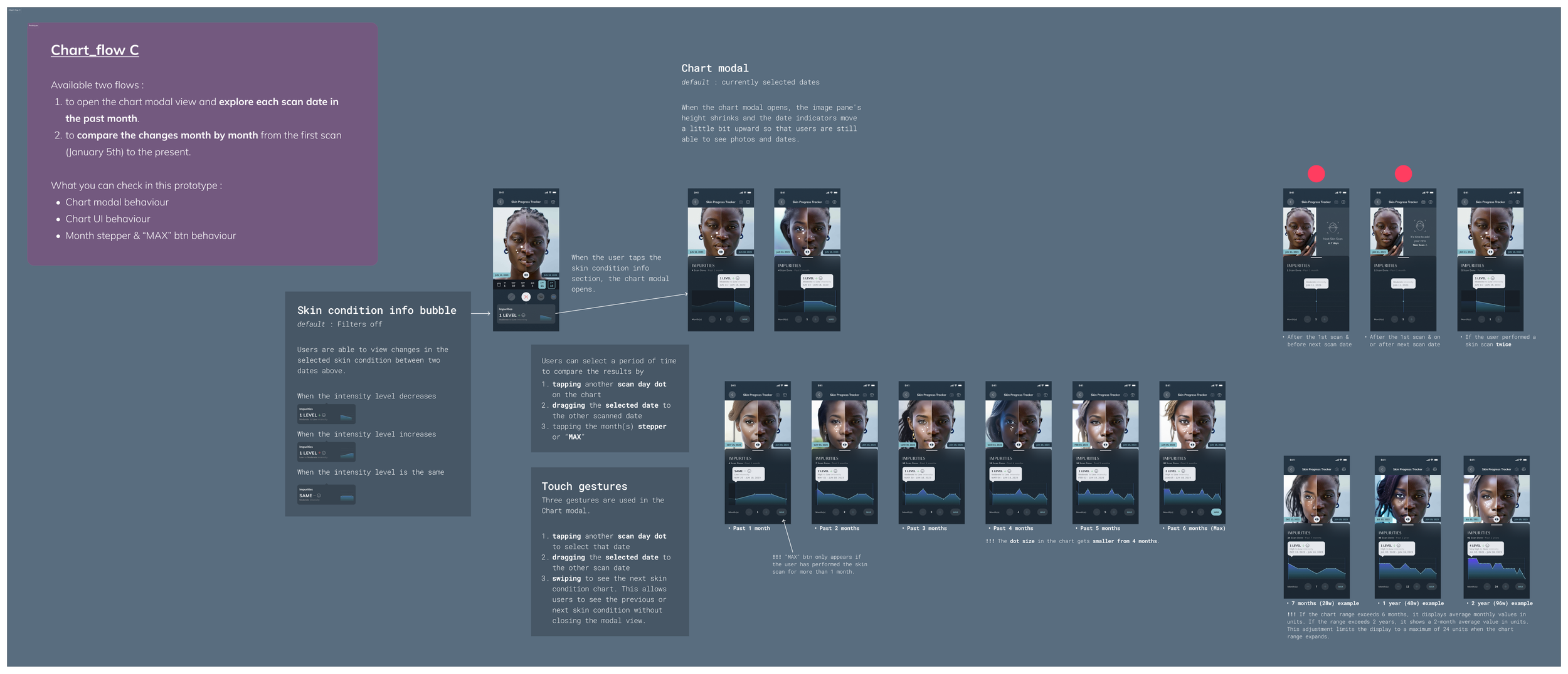
Data-vis Analytics (Chart Mode)
A chart view that plots skin score over time. Tapping any data point surfaces the corresponding scan image. Designed for users who want pattern recognition, not just individual snapshots.
Core Interaction Prototype
The Adoption Problem and What It Revealed
Initial adoption was 1%. The feature existed, but users were not finding it.
This forced a hard look at the entry point logic. The analytics feature was reachable, but it was not obvious. Users had no reason to seek it out proactively, and no trigger to return once they had found it.
The fix was not a UI change. It was an architecture change: redesigning entry points as proactive re-engagement triggers, not passive destinations. Reminders, post-scan prompts, and progress nudges were woven into the flow as active redirects toward the analytics layer.
This was the most important design learning of the project. Visibility of a feature is not the same as discoverability. A well-designed system has to pull users toward insight, not wait for them to arrive.
Outcomes
Result
Metric
238% increase over 3 months
User growth
3,846 (Dec 2024, Jan 2025 peak)
Monthly active users
2.8x surge in users within 3 months
Growth rate
Average 1.45 skin scans per day per active user
Engagement
The system handled the growth without performance degradation. The data architecture built for scale held up when scale actually arrived.
Design Learnings
Progress needs a reference point, not just a measurement.
A single score means nothing without something to compare it to. The entire system is built around the relationship between moments in time, not around individual data points in isolation.Discoverability is architecture, not UI.
The 1% adoption problem was not solved by making the feature more visible. It was solved by redesigning when and how users were directed toward it. Entry points are part of the system, not decorations on top of it.Data integrity determines design integrity.
Normalization and scheduled reminders are not backend concerns. They determine whether the design tells the truth. A trend line built on inconsistent data is worse than no trend line at all.Scalable architecture is a design decision.
Designing the Asset Manager and the data flow before designing the interface meant the system could absorb 238% user growth without structural changes. Systems thinking before screen thinking.